Hey, just wanted to say fantastic work on this. It seems to be your first release but the quality is far beyond that of your average first release.
The page alone is super well done, and that isn't even getting around to talking about the quality of your assets. Lots of variety, and lots of great style.
Keep up the amazing work, excited to see how you progress.
Thanks a lot ! Yes I tried to spend some time not only on the sprites but also on the presentation cause I think it's actually very important if you want to attract people.
While scrolling on itch I saw your work too, and it seems that you like retro style too (very nice assets btw, I love these little 8x8 rts/strategy tiles and the palette looks really good).
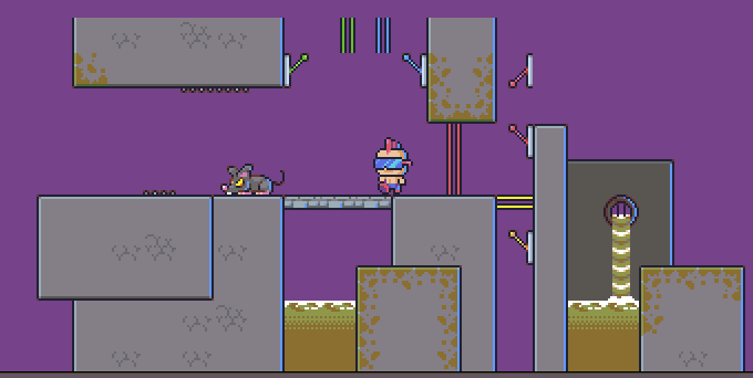
I will continue updating this demo pack and have planned to realise more expansion (I'm working on a sewer expansion for this pack) so stay tuned !
Thank you very much ! I'm currently working on an underground expansion. Tell me if you have any suggestions for blocks and icons you would like to see. I will also probably wait for my project to be indexed to start releasing devlogs and updates
I actually spent a few hours with the assets in Godot. My initial suggestions would be:
a couple of attack animations for the player
"Sign of the horns" gesture(if you can pull that off with so few pixels)
Love the style and looking forward to seeing what you come up with. I can provide more suggestions if you want them. Like an enemy that violently vomits as its attack seems pretty punk to me. Or small stuff like bottom grass corners:
Sure. I think the horn gesture is a good idea. I also have planned to make attacks animations for the player, but since it's a platformer, for now you can use the jump on enemy mechanic to kill it (this is why the enemy death animation look like that). For the missing tiles, this was purely intended (I did the tiles, and still have it) but didn't want to use it to keep that retro limitation style. However I think adding it is just a plus so I'll add them back. This is also why I added AA in every tiles corner, because in older games, tiles couldn't have transparency, and I love that render even if it can look dirty in some places. Thanks for the feedback, I will soon update the files, stay tuned !
Edit : I can also show you a sneak peak of the next update (this is just a few tiles, and some might change)
Have you considered maybe starting a Discord server for your assets and/or this series? Great way to get suggestions/feedback and showcase stuff in the works.
← Return to asset pack
Comments
Log in with itch.io to leave a comment.
Hi, I was just wondering how development was progressing? Such a cool pack.
Hey, just wanted to say fantastic work on this. It seems to be your first release but the quality is far beyond that of your average first release.
The page alone is super well done, and that isn't even getting around to talking about the quality of your assets. Lots of variety, and lots of great style.
Keep up the amazing work, excited to see how you progress.
Cheers from a fellow pixel artist.
Thanks a lot ! Yes I tried to spend some time not only on the sprites but also on the presentation cause I think it's actually very important if you want to attract people.
While scrolling on itch I saw your work too, and it seems that you like retro style too (very nice assets btw, I love these little 8x8 rts/strategy tiles and the palette looks really good).
I will continue updating this demo pack and have planned to realise more expansion (I'm working on a sewer expansion for this pack) so stay tuned !
Sounds fantastic!
I'll probably wait for the expansions before I try to make something with these, but I made a small donation to help further development :)
Thank you very much ! I'm currently working on an underground expansion. Tell me if you have any suggestions for blocks and icons you would like to see. I will also probably wait for my project to be indexed to start releasing devlogs and updates
I actually spent a few hours with the assets in Godot. My initial suggestions would be:
Love the style and looking forward to seeing what you come up with. I can provide more suggestions if you want them. Like an enemy that violently vomits as its attack seems pretty punk to me. Or small stuff like bottom grass corners:
Sure. I think the horn gesture is a good idea. I also have planned to make attacks animations for the player, but since it's a platformer, for now you can use the jump on enemy mechanic to kill it (this is why the enemy death animation look like that). For the missing tiles, this was purely intended (I did the tiles, and still have it) but didn't want to use it to keep that retro limitation style. However I think adding it is just a plus so I'll add them back. This is also why I added AA in every tiles corner, because in older games, tiles couldn't have transparency, and I love that render even if it can look dirty in some places. Thanks for the feedback, I will soon update the files, stay tuned !

Edit : I can also show you a sneak peak of the next update (this is just a few tiles, and some might change)
Have you considered maybe starting a Discord server for your assets and/or this series? Great way to get suggestions/feedback and showcase stuff in the works.
It is a good idea, I will do that.